
Build a page with sections
Overview
The page builder makes a page from sections. A section holds parts, such as headings, text, images, buttons, grids and carousels. You select a part on the canvas and change it in the Element panel. Each part can look different on a desktop, a tablet and a phone.
Before you start
You need a role that can edit pages. To publish without approval, your role also needs Publish. See Roles and access.
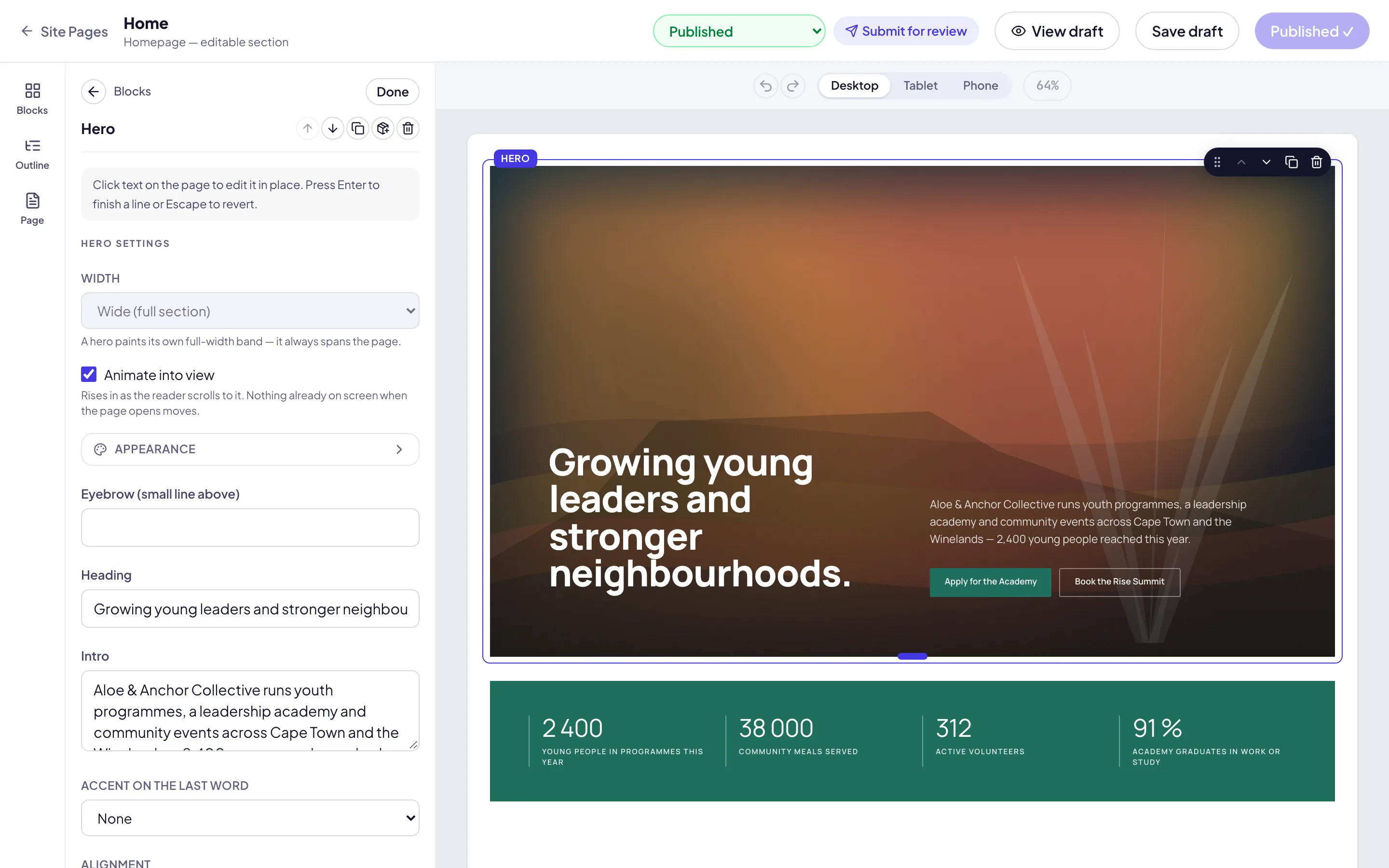
Zavon switches sections on for your organisation. Until then, the editor shows blocks only. See Create a page.
Add a section
Open the page
In the sidebar, select Site › Pages. Open the page. The page builder opens.
Open the picker
Point at the space between two sections and select the + button. Or select the + button at the end of the page.
Start from a layout
In Add a section, select Layout. Select Empty, 2 columns, 3 columns, 4 columns or a grid.
Or start from a ready-made section
Select Sections. Select a section, such as Hero, split, Stats or Call to action. Type in Search sections to find one.
Use a saved section
Under Saved, select one of your organisation’s section templates.
Paste a section
To add a section that you copied, select Paste.
Add and select parts
Open Add
In the rail, select Add. The panel has two tabs, Elements and Sections.
Find a part
On Elements, look under Basic, Dynamic and Ready-made blocks. Type in Search (/) to find one by name.
Add the part
Select a part. It goes into the selected container, or after the selected part. Or drag it onto the canvas.
Select a part
Select any part on the canvas. The Element panel opens on its Content tab.
Type on the canvas
Select a heading or a button and type the words where they are.
Go back
To add another part, select Back to Add. Esc does the same.
Change a part’s settings
Set the content
On the Content tab, set what the part shows, such as its Text, Image or Link.
Set the look
Select the Style tab. Set the Colour, Spacing, Background and Corner radius.
Open More
Select More at the end of a tab to see the settings that a part seldom needs.
Set the advanced settings
Select the Advanced tab. Set the Anchor ID, the Entrance animation, and Hide on tablet or Hide on mobile.
Use the part’s menu
Open the part’s menu with the right mouse button, or select More actions on a section’s tab. Then select Duplicate, Copy, Paste style, Wrap in container or Delete.
Arrange parts in Layers
Open Layers
In the rail, select Layers. Every section and part of the page shows in order. ⌘I (Ctrl+I on Windows) does the same.
Select from Layers
Select a row. The canvas scrolls to the part, and the Element panel opens.
Move a part
Drag a row to a new place. Or use the arrow keys with the row selected.
Rename a part
Select the part’s name twice, quickly, and type a new one. Return keeps it.
Hide it while you work
Select the eye button beside a row. The part stays on the page; only the canvas hides it.
Set a part for each device
Select the width
Beside Editing above the canvas, select Desktop, Tablet or Mobile.
Change a setting
Select a part in the frame and change a setting. The change applies at that width only.
Read the mark
Read the mark beside the setting. It shows the width that you change, such as Tablet override.
Undo an override
Select Reset beside the mark. The setting goes back to Inherited.
Switch quickly
Select the device mark beside a setting to go to the next width. ⇧⌘M does the same.
Save a section as a template
Open the menu
Select More actions on the section’s tab. Select Save as template.
Name it
Type a Template name. Select Save.
Use it again
On any page, select Add, then Sections. The template is under Saved.
Publish the page
Publish
Select Publish. The message says Published. Select View page to see it on the site.
Keep a draft
Select the arrow beside Publish, then Save draft. The live site does not change.
Discard your changes
Select the arrow beside Publish, then Discard changes.
Or send it for review
If your role cannot publish, select Submit for review. An approver decides.
Troubleshooting
If the controls of a section are grey and say Sections are not switched on for this organisation., ask Zavon to switch sections on.
If a setting is grey, its tooltip says why. For example, Column span shows only for a part in a grid.
If a block from before sections shows its own settings, it is a block on its own. Select Convert to section to place parts beside it.
If Paste is grey, nothing is copied yet. Copy a part or a section first.
If Save draft is grey, the page keeps no separate draft.
If Discard changes is grey, there are no unpublished changes.
If the page builder does not open on a phone, open the page on a larger screen. On a phone, the editor is a preview.
Good to know
Desktop first. A setting at Desktop applies at every width, unless Tablet or Mobile sets its own. Tablet applies up to 1023 px, and Mobile up to 599 px.
Rows on a phone. A new row of columns stacks on Mobile by itself.
Undo and History. Select Undo or Redo above the canvas, or press ⌘Z and ⇧⌘Z. Select History, or press ⇧⌘H, for every change of this session in words.
Theme. Select Theme above the canvas to change the theme’s colours, fonts, text styles, spacing, buttons and motion. Select Save theme draft, then publish it on the Theme screen. See Theme.
Design check. Select Design check to list spacing, type, buttons, headings, alt text and contrast that break the house rules. Select Go to the part to fix one.
Dynamic parts. Dynamic holds a Carousel, Tabs, an Accordion, a Counter and a Collection list of your events, talks or posts.
Ready-made blocks. Every block from the block editor can sit inside a section. Its settings show on the Content tab.
Keyboard. ⌘D duplicates, ⌘C copies, ⌘V pastes, ⌘G wraps in a container, and Delete removes the selected part.
Create a page: start a page and publish it.
Header and footer: build the site’s header and footer with sections.
Theme: the colours, fonts and buttons that every section wears.
Blocks reference: the ready-made blocks.
Edit together: when two users edit one page.