
Design system
Overview
The design system holds the values that your components draw with. It has named colours, a type scale, spacing, corners, shadows, motion, icons and a loader.
Site administrators and designers change it on the Theme screen. Changes stay in a draft until someone publishes them, and Pages keeps every published version.
Before you start
To change the design system, your role needs Edit on the Theme area. Without it, every control is grey and says why. See Roles and access.
To publish a version yourself, your role also needs Approve components and design systems. Without it, you submit the version for approval. See Approve design changes.
Change the draft
Open the screen
In the sidebar, select Theme. The Colours tab opens, with the Specimen of the draft beside it.
Select a tab
Select a tab: Colours, Fonts, Text styles, Spacing & layout, Buttons or Motion.
Change the values
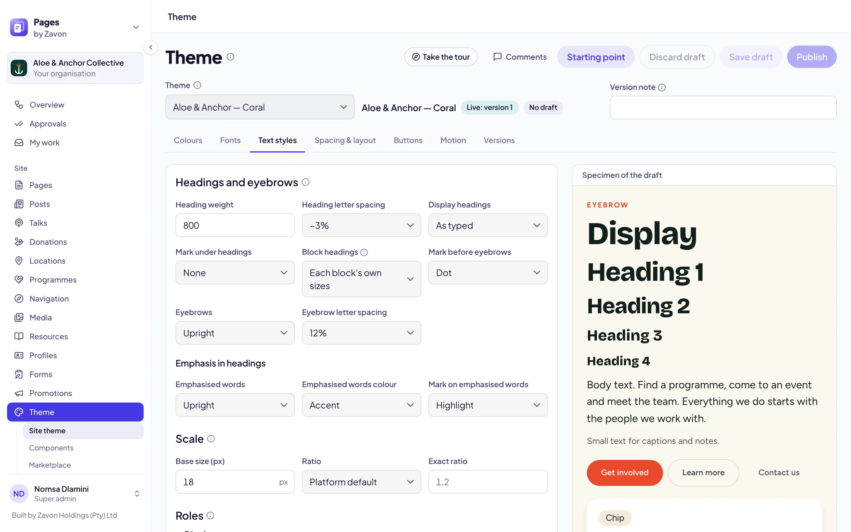
Change the values you need. The specimen shows the draft on headings, text, buttons, a card and a chip.
Save the draft
Select Save draft. The label beside the theme name changes to Draft saved.
Or start again
To throw the draft away, select Discard draft. In the dialog, select Discard draft. The live theme does not change.
Open another theme
Select the theme
On the Theme screen, set Theme to one of your themes. The list marks The site’s theme.
Read the notice
Read the notice on the screen. Changes to a theme that the site does not use reach only the pages that use it.
Change it
Change, save and publish its draft as for the site’s theme. The site’s theme does not change.
What each tab holds
Colours. The colour roles, such as Accent and Dark band, the words on bands and the contrast of each pair. Under Swatches, select Add swatch to name up to 12 more colours.
Fonts. Headings and body sets the faces of headings and body copy. Display and monospace sets a display face and a monospace face.
Text styles. The styles of headings and eyebrows, then the Base size (px) and the Ratio of the type scale. Under Roles, each role has a step, a weight, a case, a Letter spacing and a face. Letter spacing is a percentage of the type size.
Spacing & layout. Shape and rhythm, then the Base unit of every gap and padding, the Corner radius scale, the Shadows and the Sections. Under Icons, the icon Set is Lucide, Phosphor or Tabler, with a Stroke (px) and a Style.
Buttons. Button fill, Button text, Button words and the corners of buttons and fields.
Motion. Durations, Easing, Movement, Effects and the Loader. See Colour and motion.
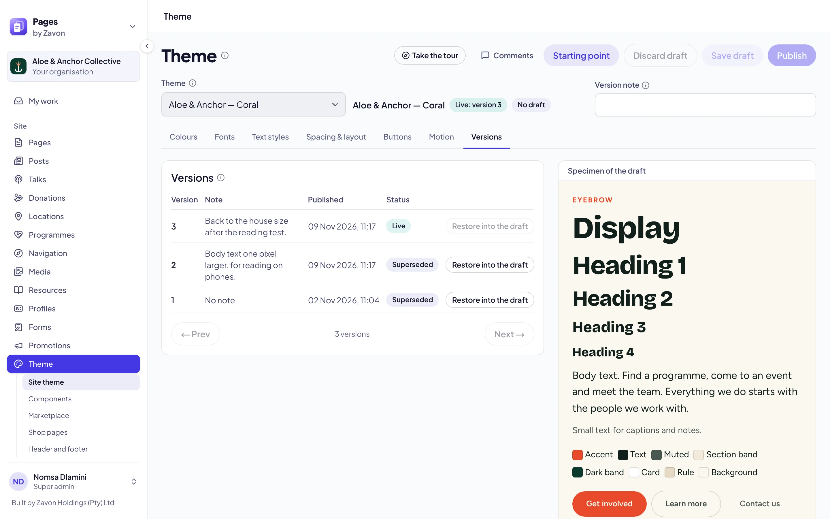
Versions. Every published version, with its note and its status.
Publish a version
Write a note
Type a Version note. The history shows it beside the version.
Publish it
Select Publish. The message names the new version, and the site shows it within five minutes.
Or submit it
If the button says Submit for approval, select it. The site keeps the live version until an approver approves.
Restore an earlier version
Open the versions
Select the Versions tab. The live version has the label Live.
Restore it
Select Restore into the draft beside a version. The draft now holds that version.
Publish it
Select Publish to make it live. Pages adds it to the history as a new version.
Choose a loader
The loader shows while part of a page loads, such as a filtered list that asks for new rows. It paints in your accent colour.
Open the loaders
On the Theme screen, select the Motion tab. Under Loader, the twelve loaders play in a grid.
Select one
Select a loader, such as Ring, Orbit or Your mark.
Set the details
Set the Size and the Speed. Type Words to show under the loader, up to 40 characters.
Use it between pages
Turn on Show while a page changes. The loader then shows in the middle of the screen while the next page loads.
Publish it
Select Save draft, then select Publish.
Create your own theme
A site on the platform’s default theme has no draft and no versions, because the default belongs to the platform. Create a theme of your own to change its design system.
Name the theme
On the Theme screen, type a Theme name.
Create it
Select Create your own theme. The site now uses your theme, and its design system opens for changes.
Or wait for approval
Wait for an approver if your role cannot approve. The new theme is submitted, and the site keeps its theme. After the approval, an approver can select Use for the site in the Starting point dialog.
Troubleshooting
If Save draft is grey, there are no unsaved edits, or a swatch name is not valid.
If Publish is grey, save or discard your edits first. A version that waits for approval must be approved, declined or withdrawn before you submit another.
If the screen says that someone else changed this theme, select Reload. Your unsaved edits are lost.
If Size or Words is grey, the Top bar is selected. Select a different loader.
If a contrast pair shows Below AA, change one of its two colours on the Colours tab.
If Theme is grey, there are unsaved edits. Save or discard them first.
Good to know
Changes from before. A site can have its own colour or font changes on top of its theme. The specimen includes them. Select Move into the draft to keep them in the theme itself.
A page’s own theme. A page can use its own theme. Open that theme under Theme to change its design system.
Reduced motion. Loaders and motion stand still for visitors who ask their device for reduced motion.
Leaving with edits. If you leave the screen with unsaved edits, Pages asks first.
Who else is here. A face in the header shows each user who has the screen open.
Comments. Select Comments to talk about the design system with your team. See Comments.
Theme: the colour roles, the fonts and the starting point.
Build components: components that draw with the design system.
Colour and motion: movement and effects.
Approve design changes: how a version is approved.