
Build components
Overview
A component is a design that you build once and place on many pages, such as a card, a band or a list of events. You build it from parts, in the values of your design system.
Each save is a new version. Pages that follow the component show a new version when it is approved.
Before you start
To build and change components, your role needs Edit on the Pages area. To approve a version, your role also needs Approve components and design systems. See Roles and access.
Set up your design system first. Components use its colours, type, spacing and corners. See Design system.
Use a tablet or a computer. On a phone, the builder shows a preview only.
Start a component
Open the list
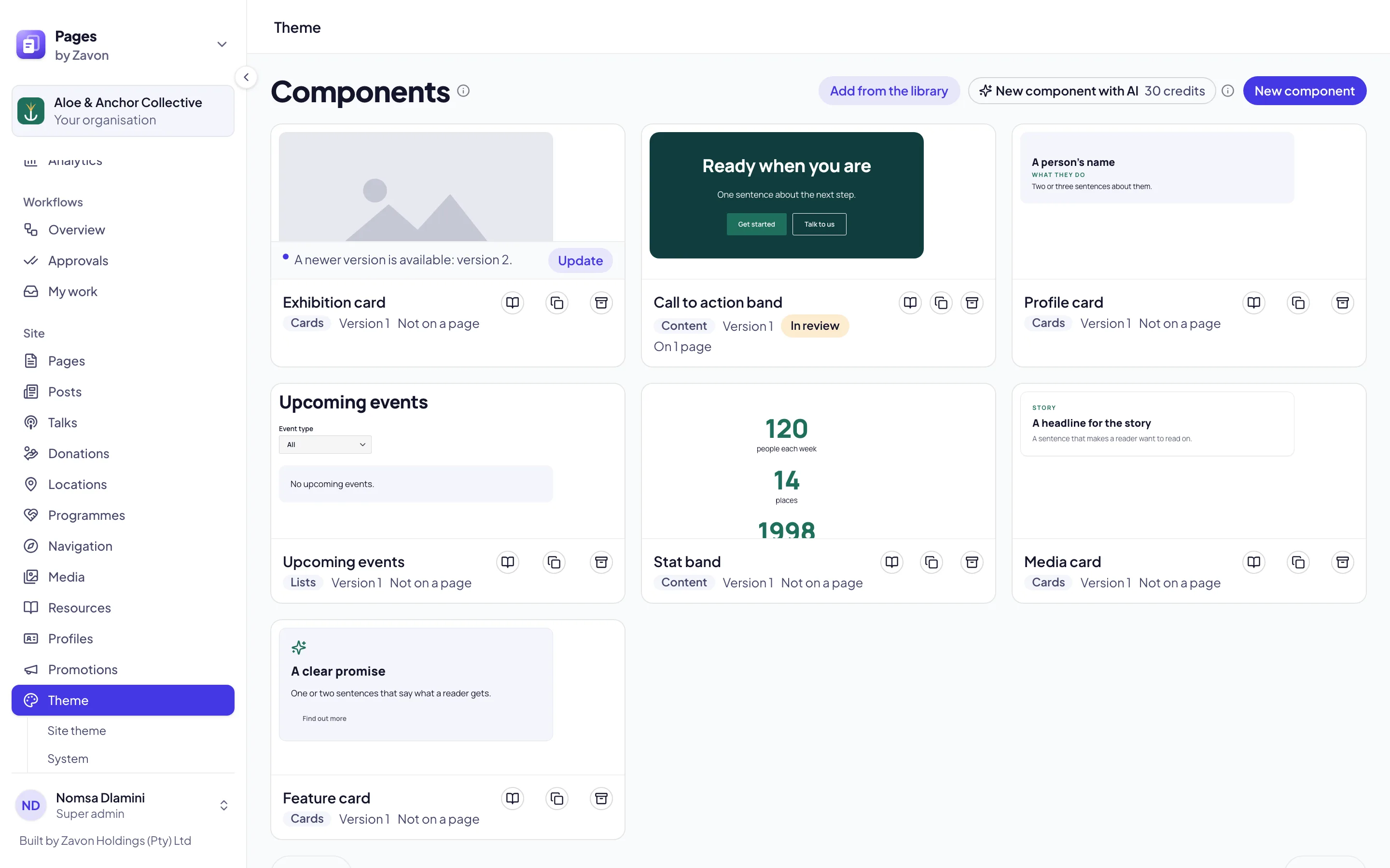
In the sidebar, select Theme › Components. Each card shows a drawing, the version and the pages that use it.
Start from the library
To start from a ready-made design, select Add from the library. The Component library opens with 47 components.
Find one
Select a category tab, such as Heroes or Cards. Type in Search the library to narrow the tab.
Add it
Select Add beside a component. A copy is added to your components, ready to change.
Or start empty
To start from nothing, select New component. The builder opens.
Or copy one
To change a copy of a component, select the duplicate icon on its card.
Build it
Add parts
In the left panel, select Add. Select a part, such as Frame, Text, Picture, Button or Video. Or drag it onto the canvas or into Layers.
Arrange the layers
Select Layers to see the parts as a tree. Drag a row to move a part, or use the arrows above the tree.
Select a part
Select a part on the canvas or in Layers. Its settings show on the Part tab.
Fill its content
Under Content, select Typed here for fixed words. Select From a field to let each page fill it in.
Set the look
Set the Fill, Corners, Padding and Type role. The lists offer only the values of your design system.
Check each width
Select Phone, Tablet, Desktop or Wide above the canvas. Set Applies to to change a part at one width only.
Name it
Select the Component tab. Type a Name, a Description and a Category.
Work faster in the builder
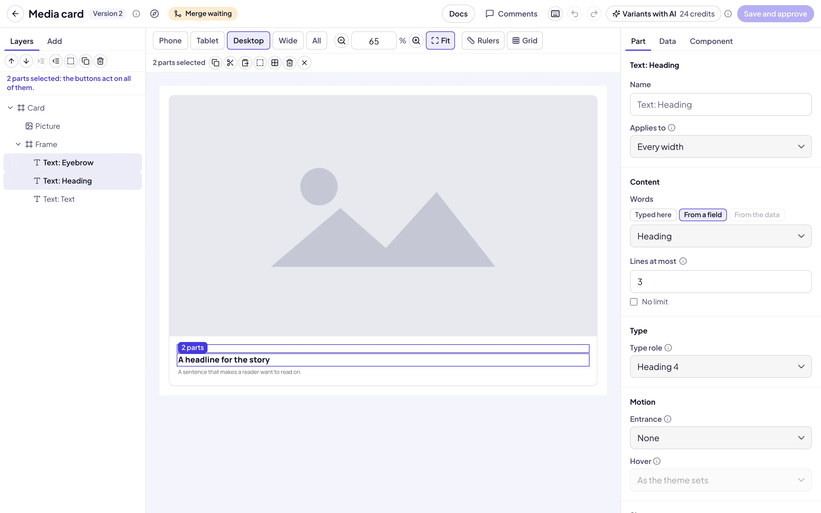
Select several parts
Hold Shift or ⌘ and select parts on the canvas or in Layers. Or drag a box on the ground around them.
Copy and paste
In Layers, select Actions, then Copy, Cut or Paste. Parts that you copy also paste into a different component.
Wrap parts
In Layers, select Actions, then Wrap in a frame or Wrap in a grid. The selected parts move into a new frame.
Zoom
Above the canvas, select View. Its button shows the zoom. Select Zoom in, Zoom out, Actual size, or Fit to fit the width to the canvas.
Measure
At Desktop or Wide, select View, then Rulers or Grid. Hold Alt (Option) over a part to measure its distance from the selection.
See every width
Select All to see Phone, Tablet, Desktop and Wide side by side.
Learn the shortcuts
Select the keyboard icon (Keyboard shortcuts) in the header, or type
?. The dialog lists every shortcut.
Fields, variants and slots
Fields. On the Component tab, under Fields, add a field for each thing that a page fills in, such as a heading or a picture. Set its Label, Kind and Default.
Variants. Under Variants, type a Name, such as tone, and two to six Values. Then select a part, set Applies to to a value, and change the part.
Slots. Under Slots, name a place where an editor adds blocks on the page. Add a Slot part where the blocks go.
Sample content. Type sample values to see the component as a page shows it.
Show live data
A component can show your published events, locations, programmes, profiles, posts or talks. Drafts never show.
Add a repeater
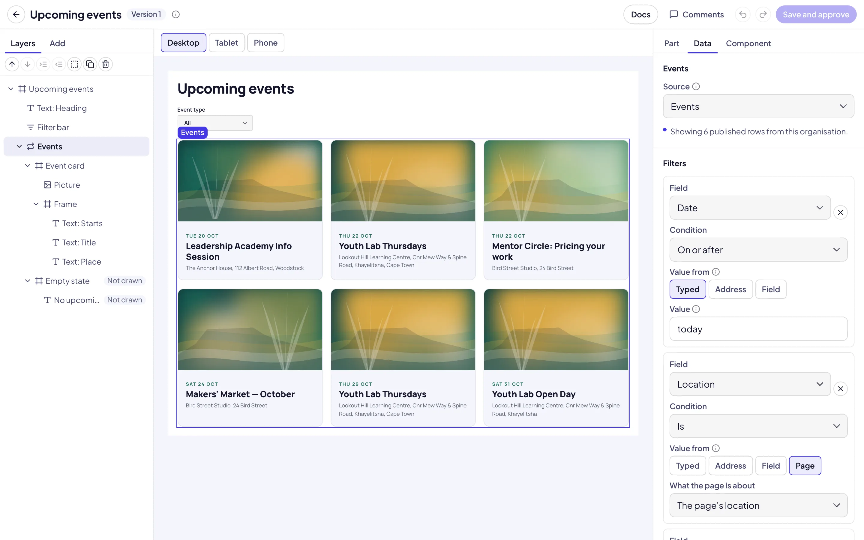
Select Add, then select Repeater. The repeater draws its item once for each row.
Set the source
Select the Data tab. Set the Source, such as Events. The canvas shows your published rows.
Add filters
Under Filters, select Add filter. Set the Field, the Condition and Value from.
Show a field
Select a part inside the item of the repeater. Under Content, select From the data and set the field.
Set the order
Under Order and number, set Sort by, Order and Items at most.
Let visitors filter
Under Filter bar, select Add a filter bar. Visitors can then narrow the list, and the address keeps their choice.
Check the empty state
Under States, set Canvas shows to Empty state. The canvas shows what visitors see when no rows match.
Repeat a list that the page fills in. On the Component tab, add a field and set its Kind to List of items. Set Items at most, and under Each item has add the fields of one item, such as a title and a Paragraph with links. Then select the repeater, open the Data tab and set Rows from to A list field. A part inside the item shows a field of the item, or Number for its place in the list. On a page, the inspector lists the items to add, reorder and remove.
Size and weight of the words. On the Part tab, a text part can set its own Face, Type size, Weight, Letter spacing, Line height and Text strength, over its type role. Face is Body face, Heading face or Display face. Type size goes up to 9XL · 128px. A frame can add Space above, and a grid can set a Smallest column instead of fixed columns.
Every second item. Select the item of a list, then set Applies to to Every second item and change it, for example to put a picture on the other side. A variant has its own every second item in Applies to.
Only when it is filled. Select a part inside the item and, under Visibility, set Shown when filled to a field. The part shows only on the items where that field has something in it, such as a link.
Keep in view. For a picture that fills its shape, choose The middle or The top to keep that part in view.
Fill the space left. Turn it on for a card’s text to keep each card’s link at the foot of the card.
Capitals and underline. Under Size and weight of the words, turn on Capitals, or Hand-drawn underline on the last word for a heading.
Save a version
Open the save dialog
Select the save button in the header. It says Save component, Save version, Save and approve or Submit for approval.
Write a note
Type a Note that says what changed. Pages shows it beside the version.
Save it
Select the button in the dialog, such as Save version 2. The list shows the new version.
Use it on a page
Open the blocks
Open the page in the editor. In the left rail, select Blocks.
Add the component
Under Your components, select the component, or drag it onto the page.
Fill it in
Select it on the canvas. In the panel on the right, fill in its fields and select a variant.
Set the version
Keep Version at Follow the approved version to get every approved change. Set a version number to keep the page as it is.
Fill its slots
Under Slots, select a block in Add to and the slot’s name. A slot takes only the blocks that its component allows, up to its limit. Select Edit beside a block to change it.
Read and export the docs
Pages writes documentation for each version: its fields, variants, slots, data, accessibility and live examples.
Open the docs
In the builder, select Docs. On the list, select the book icon on the card.
Set the version
Set the Version to read the docs of an earlier version.
Add guidance
Select Write guidance to add advice for editors. It applies to every version.
Download them
Select Export as Markdown. The docs download as a file.
Troubleshooting
If the save button is grey, hold the pointer on it. It gives the reason, such as a missing name on the Component tab.
If From the data is grey, the part is not inside the item of a repeater.
If the canvas shows sample items, no published rows match the filters yet.
If the dialog says that a newer version was saved after you opened the component, Pages keeps your version for a merge. Select Load the latest version, Open the merge or Save anyway. See Edit together.
If Rulers and Grid are grey in View, the canvas is at Phone, Tablet or All. Select Desktop or Wide.
If Paste does nothing, the clipboard holds no parts of a component. Copy a part first.
If a component has the label Deprecated, pages that use it keep it. It is not offered for new placements.
Good to know
The library. The Component library has 47 components in seven categories: Cards, Content, Heroes, Media, Lists, Structure and Forms and money. Each one has its own documentation and variants.
Copies from the marketplace. A component that you installed from the marketplace says A newer version is available on its card and in the builder. Select Update to add the newer version to your copy. See Marketplace.
Tour. Select the compass icon (Tour this screen) in the builder header to see the tools step by step.
Video and embeds. The Video part plays YouTube, Vimeo, a YouTube live stream or a video file. The Embed part shows a map, a form or a booking page from a service on the embed list. See Media library.
Motion. Each part has its own Entrance and Hover under Motion. See Colour and motion.
Undo. Undo and Redo are in the header.
Comments. Select Comments in the header to talk about the component. A comment can be about one part.
AI assistance. When AI assistance is on for your organisation, New component with AI drafts a component from your description. Variants with AI suggests variants. Add section with AI can use your approved components, and Change with AI can rewrite a component’s fields. You check the result before it is saved. See AI assistance.
Design system: the values that components draw with.
Approve design changes: how a new version is approved.
Edit together: when two people save a component at once.
Marketplace: install and offer components.
Create a page: the page editor.
Blocks reference: the blocks that a slot can hold.